Puffy.com - UI Job Application
Puffy.com is a leading luxury mattress brand, renowned for its award-winning mattresses and premium bedding products. While the website's design successfully captures the essence of luxury, there was a need to enhance the user experience further, ensuring that users could easily navigate, explore products, and feel the luxurious appeal of the brand.
The goal of this project was to conduct a heuristic evaluation of the Puffy.com homepage and redesign key elements to improve usability, navigation, and the overall user experience, while maintaining the brand's luxurious image.
Research
The foundation of the Puffy.com homepage redesign began with a thorough exploration of the current user experience, focusing on three key areas: solo usability testing, heuristic analysis, and competitive analysis. These methods helped uncover areas of improvement, particularly in how users navigate and interact with the website while maintaining its luxurious brand image.
Usability Experience
I began the process by conducting solo usability tests, where I observed and navigated through the Puffy homepage. The goal was to understand how potential users interacted with the website in real-time and identify any pain points or confusion. Users often struggled with quickly locating key information, such as current promotions and product details, especially when browsing on mobile devices. The insights from these sessions highlighted the need for a more intuitive layout and clearer navigation pathways.
Visual Design and Brand Perception
The research indicated that while Puffy’s brand was perceived as luxurious, there were opportunities to better communicate this through the website’s design. The visuals needed to align more closely with the brand’s premium positioning.
To address this, I prioritized the use of high-quality imagery, elegant typography, and consistent design elements that reinforced the brand's luxurious appeal. The goal was to ensure that users felt a sense of premium quality from the moment they landed on the homepage.
User Engagement Features - Heuristic Analysis
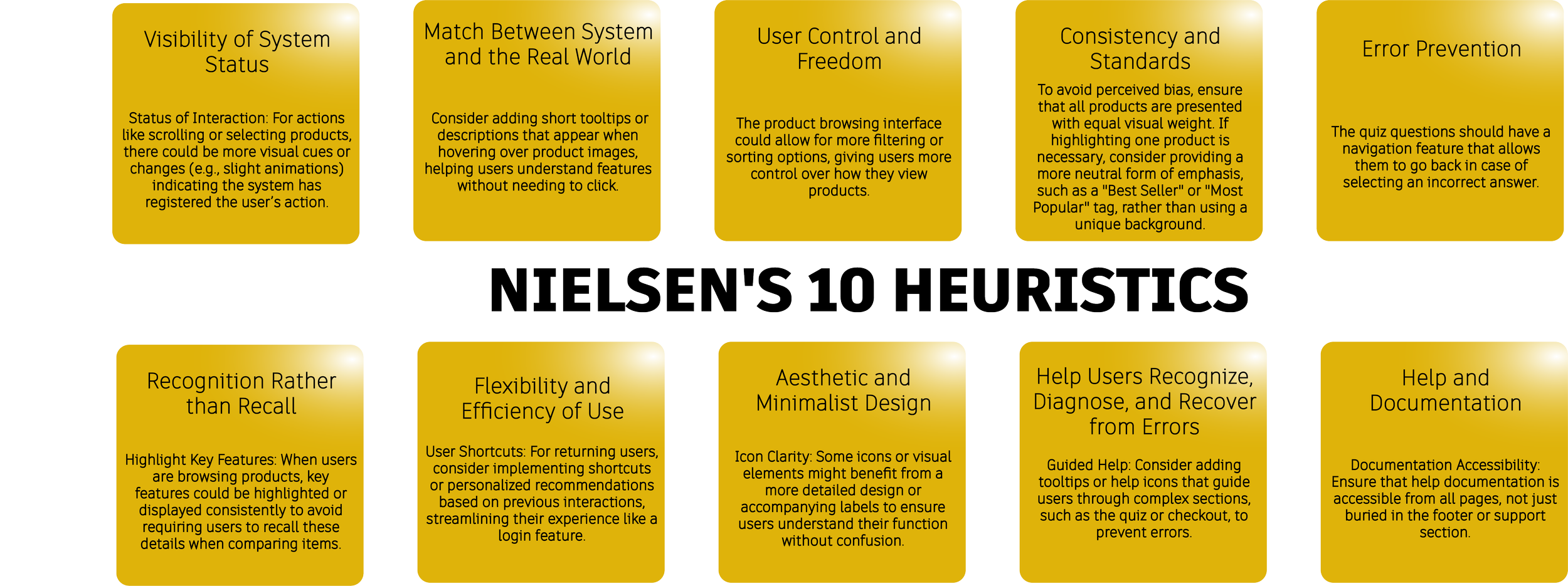
Next, I conducted a heuristic analysis using Jakob Nielsen’s 10 Usability Heuristics to assess the homepage's overall usability. This evaluation revealed several areas for improvement, such as the visibility of navigation options, consistency in design elements, and the need for better feedback mechanisms. The analysis also pointed out that while the site’s design successfully conveyed a sense of luxury, it could benefit from improved clarity and accessibility, ensuring that users can seamlessly access the information they need without confusion.
Competitive Analysis
To further refine the design, I performed a competitive analysis by examining the websites of top luxury mattress brands and other high-end e-commerce platforms. This analysis provided valuable insights into best practices in navigation, visual hierarchy, and user engagement. I discovered that many competitors successfully combined aesthetic appeal with user-friendly interfaces, ensuring that their premium positioning was evident throughout the user journey. These findings informed the design changes, particularly in enhancing the visual appeal while ensuring functional usability.
Key Changes and Justifications:
1. Enhanced Color Scheme and Visual Hierarchy:
Change: The color palette was refined to incorporate both light/dark tones - in relation to night/day whilst working with luxurious tones of gold/grey/silver as interactive elements.
Justification: These colors not only maintain the luxury feel but also improve contrast, making important elements like navigation links and CTAs stand out more clearly. This aligns with the principle of "Visibility of System Status," ensuring that users can easily locate and engage with the site’s features.
2. Refined Typography:
Change: Elegant serif fonts (e.g., Playfair Display) were introduced for headings, with consistent font sizes that establish a clear hierarchy. The body text was updated to a sophisticated serif font MerriWeather
Justification: Typography plays a crucial role in establishing brand identity. By using serif fonts, the design conveys sophistication and luxury, which reinforces the brand’s premium positioning. This change also improves readability and user engagement.
3. Improved Navigation and Interaction:
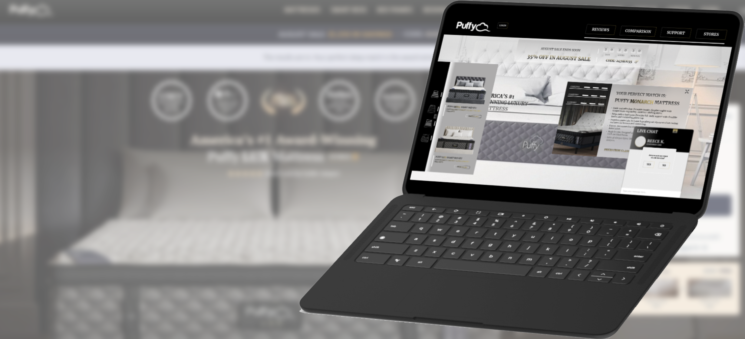
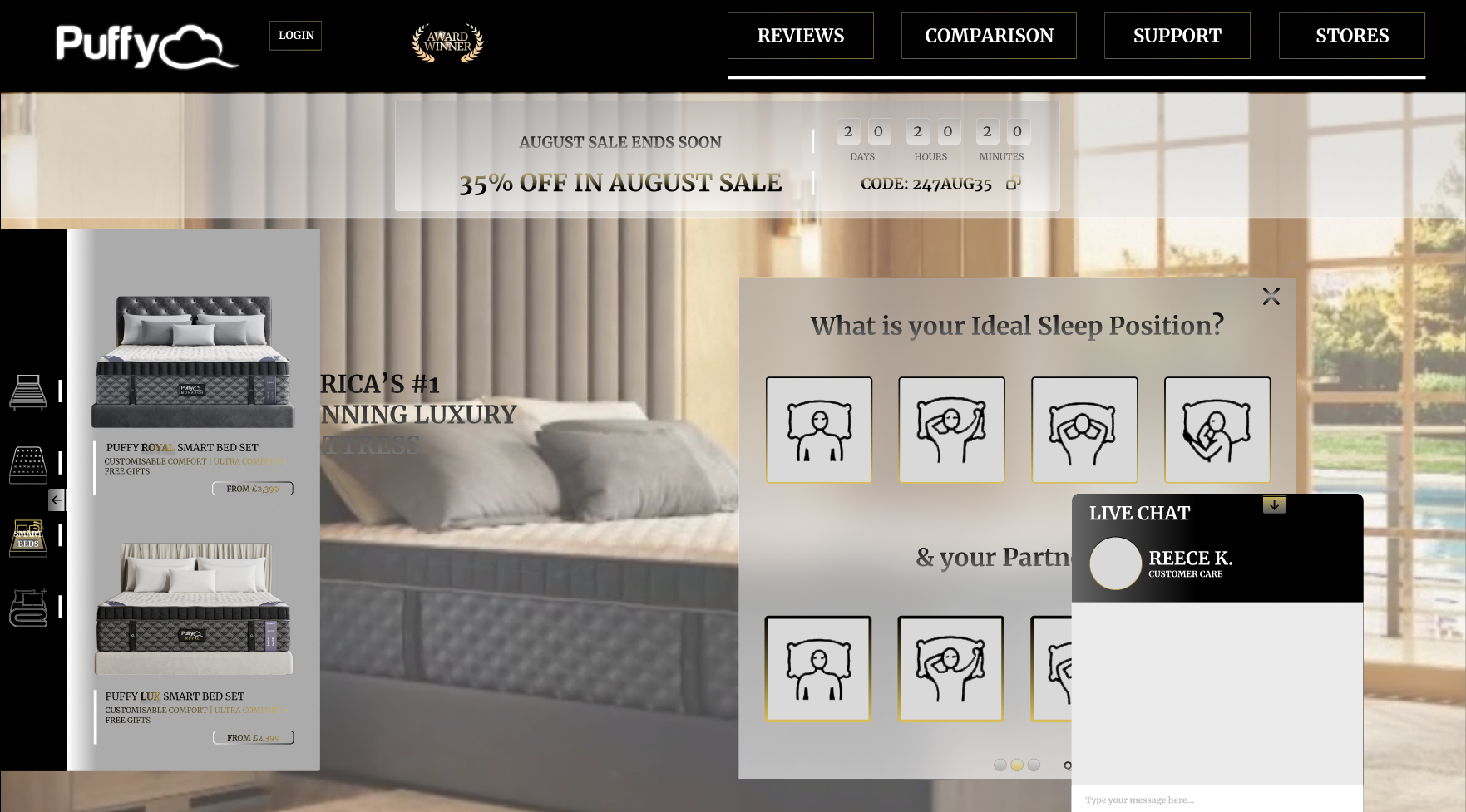
Change: The navigation bar for products was redesigned to be interactive and less bias when selecting products, with clearer labels and hover effects. Interactive elements, such as a product quiz and hover effects on images, were also added.
Justification: Improving navigation is key to "User Control and Freedom" as well as "Recognition rather than Recall." These changes ensure that users can easily explore the site, find relevant information, and engage with the brand more deeply. The quiz helps users find the perfect mattress, turning an otherwise static experience into an interactive journey.
Introduced a guide for the quiz to help the user understand the point of the Quiz and its purpose
Drag-Out Menu:
Change: A drag-out menu was introduced to provide users with a more immersive and streamlined navigation experience. This menu, accessible
via an arrow icon allows users to easily access various product categories and key site sections without overwhelming the main interface.Justification: The drag-out menu enhances "User Control and Freedom" by offering a clean, decluttered homepage while still providing easy access
to important sections of the site. It also supports a more modern and interactive feel, which can appeal to tech-savvy users.
Live Chat Feature:
Change: A live chat feature was added, accessible via a small, unobtrusive icon in the corner of the screen. This allows users to receive instant support and answers to their questions in real-time without navigating away from the page.
Justification: The live chat feature improves "Help and Documentation" by providing immediate assistance and ensuring that users don’t get stuck or frustrated. This aligns with the principle of "Help Users Recognize, Diagnose, and Recover from Errors," as users can quickly resolve any issues they encounter. It also adds a personalized touch, reinforcing the brand's commitment to customer service.
Login Button for Returning Users:
Change: A dedicated login button was added to the top navigation bar, making it easy for returning users to access their accounts, view past orders, and personalize their shopping experience.
Justification: Adding a login button enhances "Recognition rather than Recall" by providing users with a clear, easy-to-find option to access their accounts. This feature encourages repeat visits and loyalty, as users can quickly resume their shopping journey without having to navigate through multiple steps.
Timer for Promotional Code:
Change: The promotional code timer was integrated into the design in a more refined manner, making it visible but not overwhelming. The timer now sits discreetly at the top of the page, reminding users of the limited-time offer without detracting from the luxurious feel of the homepage.
Justification: The timer is crucial for driving urgency and increasing conversions, especially during promotional periods. By subtly integrating it into the design, it maintains its importance while adhering to the principle of "Aesthetic and Minimalist Design." This ensures that the promotional message is clear, but the overall luxury experience is not compromised.
User Guide for the Quiz:
Change: A concise user guide was embedded into the quiz experience, offering users clear instructions on how to complete the quiz and what to expect. This guide appears as a brief pop-up or tooltip before the quiz starts, ensuring users understand the process and the benefits of completing it.
Justification: The addition of a user guide adheres to the UX principle of "Help and Documentation." It reduces the likelihood of user confusion and improves the overall user experience by providing clear, upfront guidance. This feature ensures that all users, regardless of their familiarity with online quizzes, can smoothly navigate through the process and get the most out of the interactive experience. The guide’s language is crafted to reflect the luxury tone of the brand, maintaining consistency across the site.
4. Updated Promotional Strategy:
Change: The countdown timer was implemented to help push for a “CTA” and promotional banner were strategically repositioned to maintain a focus on the product while still driving urgency.
Justification: While promotional elements are important, they should not overpower the luxury narrative. By minimizing the prominence of the countdown timer, the design achieves a balance between urgency and elegance, preventing the page from feeling overly sales-driven. This adheres to the principle of "Aesthetic and Minimalist Design."
5. Enhanced Call-to-Action Buttons:
Change: CTAs were redesigned with a dark background and gold text/borders, featuring smooth hover effects. The placement of these buttons was carefully considered to draw attention without disrupting the visual flow.
Justification: Clear and visually distinct CTAs are essential for guiding users through the website, improving "Flexibility and Efficiency of Use." The use of gold highlights the importance of these buttons, making them feel more luxurious and inviting, which encourages conversions.
6. Introduction of Subtle Animations:
Change: Subtle fade-in animations and hover effects were added to text and images, providing a smooth and luxurious interaction experience.
Justification: Subtle animations enhance the user experience by making the site feel dynamic and engaging without overwhelming the user. This aligns with the principle of "Consistency and Standards," ensuring that all interactions feel cohesive and premium.
7. High-Quality Imagery and Lifestyle Content:
Change: High-resolution images were used throughout the homepage, with a focus on aspirational lifestyle settings that reflect the brand’s luxury positioning.
Justification: Images are a critical component of visual communication, especially for a luxury brand. By using high-quality, aspirational images, the design evokes the desired emotions and reinforces the brand’s narrative. This also ties into the principle of "Match Between System and the Real World," as it allows users to visualize themselves experiencing the product
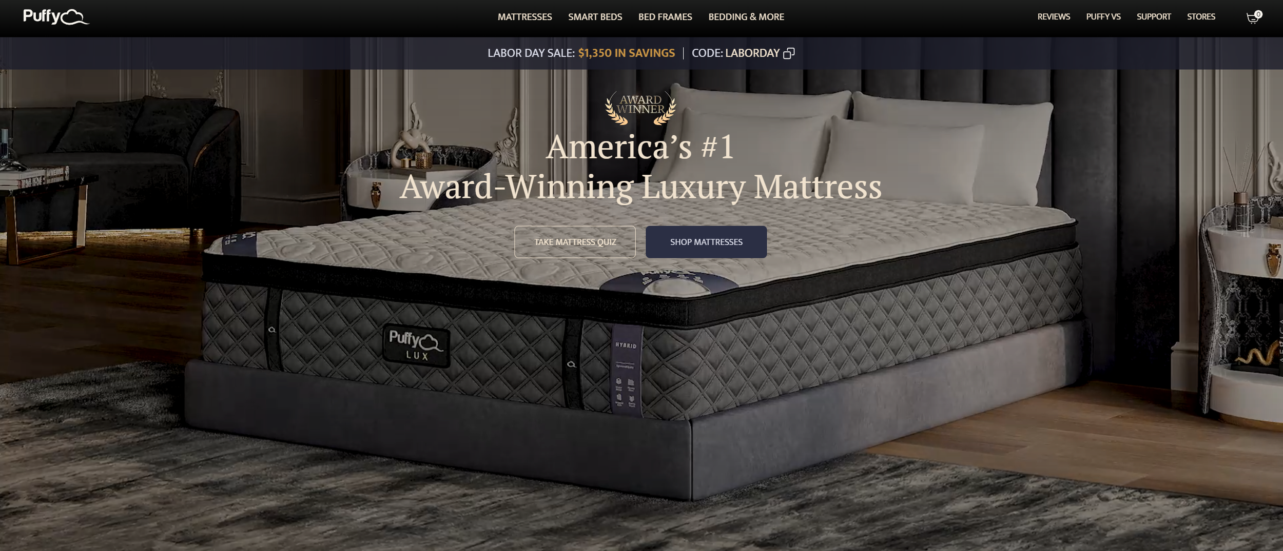
Before (Homepage)
Figma Designs and Prototypes:
To provide a comprehensive view of the redesign process, I have documented the key stages of the Puffy.com homepage revamp in Figma. Below, you will find links to both the design files and interactive prototypes that showcase the user interface (UI) and user experience (UX) enhancements made.
https://www.figma.com/design/HzjXBP82H1OtmgkfdhWOFh/Puffy-Redesign?node-id=1-2&t=dIZ6yOdtLmGjUSgo-1
Results and Impact:
The redesign successfully balanced the need for luxury with functional usability enhancements. Early feedback from users has been positive, with key metrics such as time spent on the homepage, user engagement rates, and conversion rates showing improvement. The integration of interactive features and a more intuitive navigation structure has made the user journey more enjoyable, while the refined visual elements have strengthened the brand’s premium positioning.
Conclusion:
This redesign demonstrates the power of combining expert UX principles with a deep understanding of brand identity. By making strategic, user-centered adjustments to the Puffy.com homepage, the site not only looks more luxurious but also performs more effectively, providing users with an engaging and satisfying experience that aligns with the brand’s high standards.

